In this series I’m working through some of the basics from Michael Nielson’s excellent book on neural networks, and intend to then proceed with some more advanced bits afterwards. Along the way, I’m going to attempt to translate some of the more math heavy aspects of neural networks into a form more targeted at engineers.
The git hub repo for this series is here: https://github.com/chriscummings100/neuralfun
So, back propagation – the magic of neural networks, and the process that makes deep neural networks (i.e. lots of layers) practical. Michael refers to the equations involved as quite beautiful, and I wholeheartedly agree, but even without the actual maths, the elegant simplicity in the process of training a neural network is something quite special!
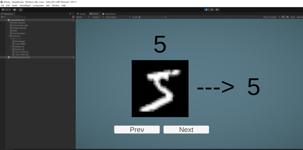
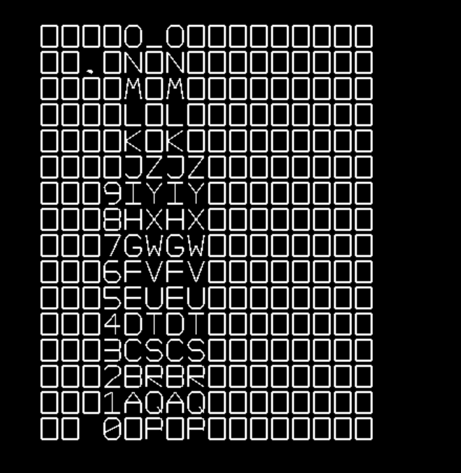
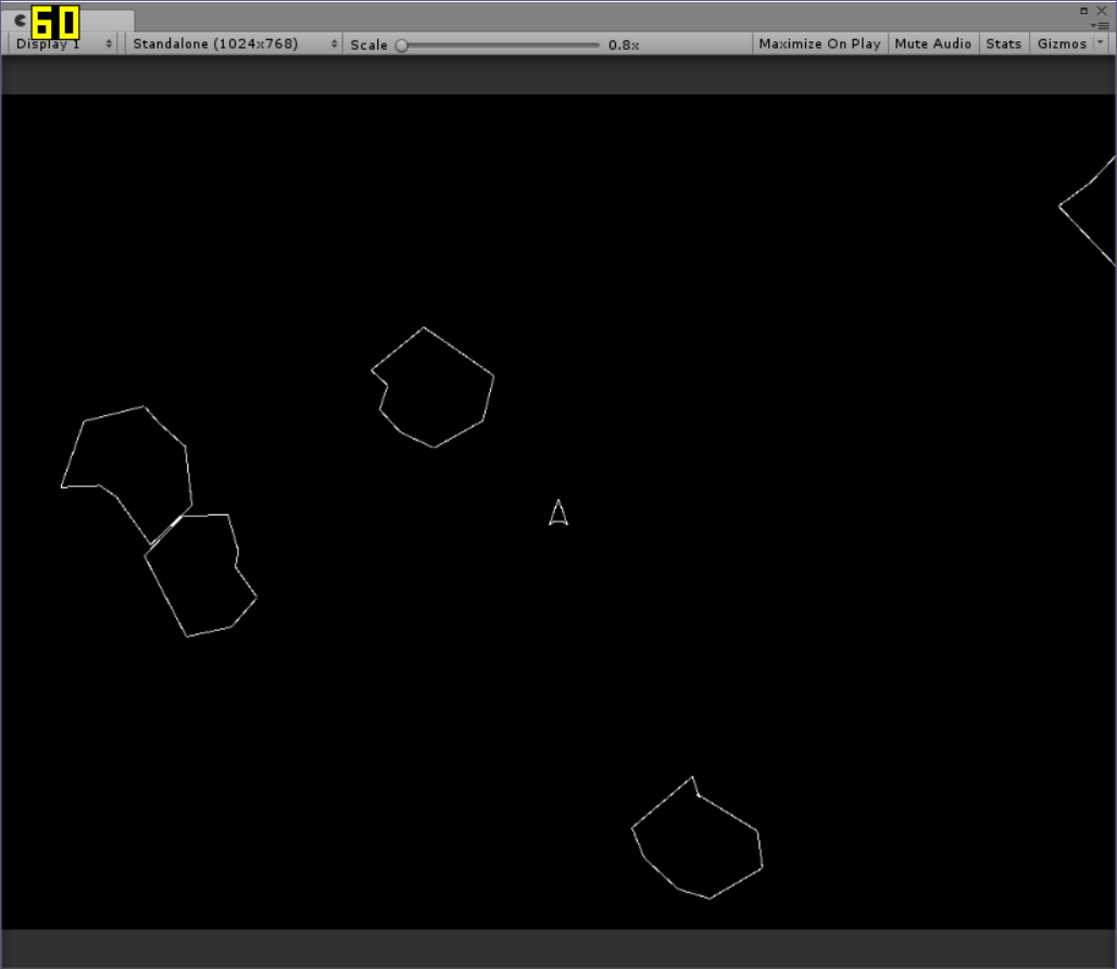
As with my previous post, before going any further, here’s a screenshot to get you incredibly excited!

The Only Bit Of Maths
There is one mathematical concept that you really need to be a little comfortable with in the world of back propagation, and that is the concept of a gradient, otherwise known (roughly) as a derivative, or rate of change. I don’t want to dig too deep into explaining math principles here – there’s plenty of books about it, but this is so important that I’ll at least have a go!
A gradient (or derivative) of a function can be thought of in lots of different ways – the steepness of a graph, its rate of change, a tangent or a slope. The way that matters to back propagation is that it defines how the parameters of a function are affecting its output at a given point. For example, with the function y=2x, a change in x always results in double the change in y.
With the multi-variable function z=y+2x we can say that a change in y always results in the same change in z, but a change in x always results in double the change in z. As such, we’ve got 2 different ‘gradient values’, one for x and one for y. Mathematically these are known as the partial derivatives. In the case of that simple function:
- The partial derivative of z=y+2x with respect to y is 1.
- The partial derivative of z=y+2x with respect to x is 2
In these 2 examples the partial derivatives are fairly intuitive and also constant – they are same regardless of the values for x or y. However in most cases, it’s more complex
- The partial derivative of z=y2+2x with respect to y is 2y
- The partial derivative of z=y2+2x with respect to x is 2
Proofs for the above reside in basic calculus, but we don’t need to worry about that here. What matters to us is that we can still work out constant values at specific points:
- The partial derivative of z=y2+2x with respect to y when y=2 is 4
- The partial derivative of z=y2+2x with respect to x when x=anything is 2
There is an important point to note here. In the case of y in the above equation, the gradient is continually changing. When y=2, the derivative of z with respect to y is 4, suggesting a change in y would result in 4 times the change in z. Whilst this is clearly not universally true (just try adding a big number to y and see what it does to the result), calculus tells us that for tiny changes in y, the gradient can be used as a good approximation to calculating corresponding changes in z.
A neural network can actually be thought of as a function – one where every weight and bias value is a parameter. However where you might have been happy picturing slopes or triangles in the above examples, with a neural network that has around 30000 weights and 40 biases (our earlier network) you’re into thousand dimensional spaces. My advice is don’t try to picture that – it’ll hurt your head and it won’t get you anywhere. However you can still ask, for a given set of inputs, how much did any specific bias or weight anywhere in the network affect the output.
The reason this question is important is because of a technique known as gradient descent. The idea is that if we know how a given parameter (eg weight 7 of neuron 2 in layer 1) is affecting the output of the network, and we know how wrong the output is, we can adjust the parameter to make the output less wrong! This is what happens with back propagation. We fire loads of different inputs into the network for which we know the desired output. For each one we calculate how wrong the output is, work out the gradients (or derivatives) with respect to every weight and bias, and then nudge them slightly in the opposite direction, resulting in an output that is less wrong. Rince/repeat a few million times and you have a trained neural network!
Now obviously there’s a load of maths to the above – especially if you want to prove it. The principles can be written with a few fairly simple equations, but in my experience, an extremely skilled but not-math-trained-brain is easily thrown off with a new symbol, or a T in an unexpected place, or a new version of multiplication that’s named after somebody…. Every game developer has been there at some point! Fortunately, the rest is fairly intuitive, and can be well understood with good old code. So let’s begin…
The Training Loop
I think this is all clearest starting from the outside and working in to the meaty bit, so we’ll start with a function called ‘DoTrainEpoch’, which does a single pass (or epoch) of training the network.
public IEnumerator DoTrainEpoch(Dataset dataset)
{
    m_epoch_progress = 0;

    //get randomly shuffled training data
    var training_data = GetShuffledTrainingData(dataset);

    //divide into batches, and train network off each batch 1 at a time
    int first_idx = 0;
    int batch_size = 10;
    while (first_idx < training_data.Length)
    {
        var batch = new ArraySegment<Dataset.Data>(
            training_data, first_idx, batch_size);
        TrainBatch(batch);
        first_idx += batch_size;
        m_epoch_progress = first_idx / (float)training_data.Length;
        yield return null;
    }

    //evaluate network after all batches done
    Evaluate(dataset);
}
This calls a function to get the training data from the dataset in a randomly shuffled array, then simply walks over the data in batches of 10. Each batch is passed to the TrainBatch function which modifies the network to get better at identifying that batch. The reason the data is shuffled is so that if we run another ‘epoch’, the batches passed in are different, so the network doesn’t just get very good with specific batches.
Note: the reason the above is in an enumerator with a yield is simply so we can get a pretty progress bar in Unity using a coroutine, and the call to Evaluate simply counts and logs how many records in the test data the network gets correct.
Whilst our app does have a button to train a single ‘epoch’, to wrap up the process of doing multiple ones, we also have another coroutine enumerator to do a full ‘training pass’:
public IEnumerator DoTrain(Dataset dataset, int epochs)
{
    m_train_progress = 0;
    for (int i = 0; i < epochs; i++)
    {
        yield return DoTrainEpoch(dataset);
        m_train_progress = (i+1) / (float)(epochs);
    }
}
As you can probably see, all we’re doing here is calling the training function multiple times.
Training a single batch
The batch is the gradient descent bit I mentioned earlier. It doesn’t actually calculate the gradients (we’ll do those next). Instead, its job is as follows:
- Calculate the weight and bias gradients for every entry in the batch and add them all up.
- The summed gradients are then scaled by a magic number (the learning rate) and divided by the batch size
- Finally, the scaled gradients are subtracted from their corresponding weights and biases.
We’ll cover TrainBatch in a few chunks as its simple but big!
//these are gradients of the cost function with respect to the weights and biases
//they all start out by 0, and are adjusted by the backpropagation algorithm
var dweight_by_dcost = new double[NumLayers][][];
var dbias_by_dcost = new double[NumLayers][];
for (int layer_idx = 1; layer_idx < NumLayers; layer_idx++)
{
    int layersize = LayerSize(layer_idx);
    dbias_by_dcost[layer_idx] = new double[layersize];
    dweight_by_dcost[layer_idx] = new double[layersize][];
    int numweights = LayerSize(layer_idx - 1);
    for(int neuron = 0; neuron < layersize; neuron++)
        dweight_by_dcost[layer_idx][neuron] = new double[numweights];
}
This first bit is nice and simple! All we’re doing here is creating some arrays to contain the summed up weight and bias gradients, all initialized to 0.
Next is the meat of the function, summing up the gradients
foreach (var datapoint in batch)
{
    //run back prop for this data point, which gives us
    //a dweight_by_cost and dbias_by_dcost just for this data point
    CalculateBackPropGradients(datapoint,
        out double[][][] datapoint_dweight_by_dcost,
        out double[][] datapoint_dbias_by_dcost);

    //now add the gradients for this data point to the running total
    for (int layer_idx = 1; layer_idx < NumLayers; layer_idx++)
    {
        for(int neuron = 0; neuron < LayerSize(layer_idx); neuron++)
        {
            dbias_by_dcost[layer_idx][neuron] +=
                datapoint_dbias_by_dcost[layer_idx][neuron];

            for (int weight_idx = 0;
                weight_idx < dweight_by_dcost[layer_idx][neuron].Length;
                weight_idx++)
            {
                dweight_by_dcost[layer_idx][neuron][weight_idx] +=
                    datapoint_dweight_by_dcost[layer_idx][neuron][weight_idx];
            }
        }
    }
}
So long as you trust my CalculateBackPropGradients function, this code is doing a pretty simple job. It’s getting the gradients for a specific data point, then simply adding them to the end result.
By the time the above is done, we’ll have all our weight and bias gradients summed up. For example, dbias_by_dcost[1][7] will contain the sum of all layer 1, neuron 7 bias gradients for each datapoint in the batch.
And finally, the weights and biases for the whole network are adjusted accordingly (the gradient descent)
//finally, we can apply 'gradient descent' to the
//weights and biases - i.e. adjust them in the
//opposite direction to the gradient, scaled
//by constant learning rate over batch size
{
    double batch_learning_rate = 3.0 / (double) batch.Count;

    //now add the gradients for this data point to the running total
    for (int layer_idx = 1; layer_idx < NumLayers; layer_idx++)
    {
        for (int neuron = 0; neuron < LayerSize(layer_idx); neuron++)
        {
            m_biases[layer_idx][neuron] -=
                batch_learning_rate * dbias_by_dcost[layer_idx][neuron];

            for (int weight_idx = 0;
                weight_idx < m_weights[layer_idx][neuron].Length;
                weight_idx++)
            {
                m_weights[layer_idx][neuron][weight_idx] -=
                    batch_learning_rate * dweight_by_dcost[layer_idx][neuron][weight_idx];
            }
        }
    }
}
Here, once again we’re looping over all neuron biases and weights, this time subtracting the calculated gradients, scaled by a learning rate (a magic number) and divided by the batch size. Why subtract? The gradients are derivatives with respect to the cost – in other words, they represent how to adjust the weights and biases if we want the network to get worse! We want to go in the opposite direction, so we subtract.
Modifying The Forward Feedback
Before diving into the actual back propagation function, we need to modify the FeedForward process from part 1. Back propagation works by running the neural network forward, evaluating the result, and then using it to tune the network’s parameters. However, to do so, it needs to know about the state of all the neurons in the network.
In this modified version, we’re outputting 2 lists – one is the activations of all neurons in each layer, and another is a new concept – the weighted inputs:
public void FeedForward(
    Dataset.Data data,
    out List<double[]> weighted_inputs,
    out List<double[]> activations)
{
    weighted_inputs = new List<double[]>();
    activations = new List<double[]>();

    double[] a = data.m_inputs;

    //add activations of input layer, and a null set of weighted
    //inputs, as it had none!
    weighted_inputs.Add(null);
    activations.Add(a);

    //feed forward through the network, outputting weighted
    //inputs and activations at each step
    for (int layer = 1; layer < m_sizes.Length; layer++)
    {
        double[] weighted_input = new double[m_sizes[layer]];
        double[] biases = m_biases[layer];
        double[][] weights = m_weights[layer];
        for (int neuron = 0; neuron < m_sizes[layer]; neuron++)
        {
            weighted_input[neuron] = biases[neuron] + Dot(weights[neuron], a);
        }
        a = Sigmoid(weighted_input);

        weighted_inputs.Add(weighted_input);
        activations.Add(a);
    }
}
This isn’t too different to the original, however now we have added:
- A new concept – the weighted inputs, which are simply the values that get generated by combining a neuron’s inputs and biases before being fed into the sigmoid activation function
- At every layer in the network, we’re outputting the full set weighted inputs and activation
This version literally just outputs more info than the old version. In fact, to help maintain the old functionality, I’ve actually wrapped the above in one with the same interface as the original:
public double[] FeedForward(Dataset.Data data)
{
    FeedForward(data, out _, out List<double[]> activations);
    return activations[activations.Count - 1];
}
All we’re doing is running the complicated one and returning the activations from the final layer.
Back Propagating!
Ok! It’s time for the back propagation function, who’s job it is to calculate gradients for all the weights and biases in the network. To do so, first a nice easy bit – we’re going to run the feed forward process. I’ve included the function signature here too so you can see it:
public void CalculateBackPropGradients(Dataset.Data data, out double[][][] dweight_by_dcost, out double[][] dbias_by_dcost)
{
    //these are gradients of the cost function with respect to the weights and biases
    dweight_by_dcost = new double[NumLayers][][];
    dbias_by_dcost = new double[NumLayers][];

    //do feed forward step and record all zs and activations
    FeedForward(data, out List<double[]> weighted_inputs, out List<double[]> activations);
At this point we now have 2 lists – the weighted inputs for each layer, and the activations for each layer.
If you read about training neural networks a term you’ll hear a lot is the cost function. This is ultimately a single measure of how right or wrong the output of your network was. As in Michael’s book, we’re going to start with what’s known as the ‘quadratic error’ function – the sum of the squares of the error for each output neuron.
Up until now I’ve talked vaguely about gradients for weights and biases etc. But what I’m really referring to when I say the gradient for the bias of neuron 3 in layer 2 is the derivative of the cost function with respect to the bias of neuron 3 in layer 2. In other words, if the cost function is a measure of how wrong our network was, we’re looking to calculate how a given parameter contributed to that wrongness.
Important note: saying derivative with respect to repeatedly is annoying and very mathy, so from here on I’m just going to refer to weight gradients or activation gradients etc. When I say weight gradient, I mean the derivative of the cost function with respect to a weight value.
We’ve also only talked about gradients for weights and biases, but we can ask ‘how much did it affect the result?’ for aspect of the network. How much did the final output of neuron 2 in the output layer affect the result? How much did the weighted input for weight 2 on neuron 4 of layer 1 affect the result? With back propagation we start by asking this question about the activations of the output layer, then use some equations based in calculus to work the results backwards through the network.
So let’s start working backwards!
int layer_idx = NumLayers - 1;
double[] weighted_input_gradient;
{
    double[] activation_gradient = Sub(activations[layer_idx],
                                       data.m_vectorized_output);
This first step calculates the activation gradient for each of the output neurons. It’s at this point that our choice of the ‘quadratic error’ cost function comes in handy – a little calculus shows that the derivative of the cost function with respect to a given output activation (aka the activation gradient) is just the actual result minus the desired result. More complex cost functions result in a little more complex math, but the code wouldn’t change a great deal.
Next, we’re going to take that activation gradient, and use it to calculate the weighted input gradient:
    weighted_input_gradient = Mul(activation_gradient,
                                SigmoidDerivative(weighted_inputs[layer_idx]));
This is the first taste of how the elegant process of back propagation works. We started out by answering the question ‘how does a given output activation affect the cost function’? We are now going to use the result to answer another question – ‘how does the corresponding weighted input affect the cost function?’.
The answer that calculus provides is relatively intuitive – the weighted input gradient is equal to the corresponding activation gradient multiplied by the sigmoid function’s gradient. Why is this intuitive? Remember the shape of the sigmoid function:

The sigmoid function converts weighted inputs to activations. For very large weighted inputs (values of x in the above graph), the sigmoid function is very flat, so a change in the weighted input will have a minimal effect on the output activation (f(x) in the above graph). However, for small weighted inputs, the sigmoid function is very steep, so a change in weighted input will have a signficant affect on the activation. So, by calculating how the activation affects the cost, then scaling it according to how flat the sigmoid function is, we get how the corresponding weighted input affects the cost.
The bias for the neuron is next, and it’s pretty easy:
    //bias gradient is equal to the weighted input error
    dbias_by_dcost[layer_idx] = weighted_input_gradient;
This might look odd at first, but consider that the bias is just a constant we add on to the sum of the inputs from previous neurons. i.e. a change of 10 in the bias of the neuron corresponds to a change of 10 in the weighted input. So if we know the weighted input has a given effect on the cost function, we can say the bias has exactly the same effect.
The weights are only slightly more complex:
    //each weight gradient for each neuron is the activation of the corresponding
    //connected neuron in the previous layer times the weighted input error
    dweight_by_dcost[layer_idx] = new double[LayerSize(layer_idx)][];
    for (int neuron = 0; neuron < LayerSize(layer_idx); neuron++)
    {
        dweight_by_dcost[layer_idx][neuron] =
            Mul(activations[layer_idx - 1], weighted_input_gradient[neuron]);
    }
Again, if you think about it, this isn’t too strange. The effect of a given weight on the weighted input depends on the activation of the neuron it links to. If the neuron it links to had a huge activation, then the weight of the link will greatly affect the weighted input (and hence the activation, and hence the cost…). Conversely, if the neuron it links to had an activation of 0, then changing the weight would have no effect whatsoever!
So where are we so far? We’ve managed to work out:
- The activation gradient for each output neuron
- From that, the weighted input gradient for each output neuron
- From that, the bias gradient for each output neuron
- And the all the weight gradients for each output neuron
Now, having reduced layer_idx by 1, comes the final, beautiful bit of magic
while (layer_idx >= 1)
{
    //this is the most special bit! here we're taking the weighted input error from the next layer and
    //using it to calculate the weighted input error for this layer. aka back propagation!
    {
        double[] next_weighted_input_error = new double[LayerSize(layer_idx)];

        for (int neuron = 0; neuron < LayerSize(layer_idx); neuron++)
        {
            //calculated weighted sum of the weighted input gradients we've
            //already calculated for the connected neurons
            double next_activation_gradient = 0;
            for (int recv_neuron = 0;
                 recv_neuron < LayerSize(layer_idx + 1);
                 recv_neuron++)
            {
                next_activation_gradient +=
                    m_weights[layer_idx + 1][recv_neuron][neuron] *
                    weighted_input_gradient[recv_neuron];
            }

            //with the sum, we can now calculate the weighted input
            //error in this layer for this neuron
            next_weighted_input_error[neuron] =
                next_activation_gradient *
                SigmoidDerivative(weighted_inputs[layer_idx])[neuron];
        }

        weighted_input_gradient = next_weighted_input_error;
    }
We’re entering a loop now, working back through the layers. At the start of each loop, we do the beautiful maths above. A simple sum uses the weights that link the neuron in this layer to those of the layer after it (i.e. the ones we just did the work for) to calculate the activation gradient for each neuron in this layer.
Once again, when you think about it, this makes sense. If we know the weighted input for a connected neuron in the next layer had a huge effect on the cost, and the weight of the link connecting this neuron to it is large, then it stands to reason the activation for this neuron will have had a huge effect on the cost as well. Conversely, if the weight of the link is 0, then the activation of this neuron is irrelevant. Similarly, if the connected neuron’s weighted input had no effect on the output, then the activation of this neuron must also have had no effect.
Having made that final leap, exactly the same math as we used earlier is applied to convert this new activation gradient to a new weighted input gradient.
And finally, all we have to do is repeat the previous process for the weights and biases in this layer.
    //repeat the process of calculating the bias and weight gradients
    //for this layer just as we did for the first layer
    dbias_by_dcost[layer_idx] = weighted_input_gradient;
    dweight_by_dcost[layer_idx] = new double[LayerSize(layer_idx)][];
    for (int neuron = 0; neuron < LayerSize(layer_idx); neuron++)
    {
        dweight_by_dcost[layer_idx][neuron] =
            Mul(activations[layer_idx - 1], weighted_input_gradient[neuron]);
    }
    layer_idx--;
}
That’s it! Basic back propagation in a nutshell. No matter how deep the network, this loop can continue to step back, layer by layer, repeating the same calculations to produce values for the weight and bias gradients. The core of training a neural network comes down to this wonderful combination of the following tools:
- The math to calculate the output layer’s activation gradients
- The ability to convert any activation gradient into a weighted input gradient
- The ability to convert any weighted input gradient into corresponding bias and weight gradients
- And finally, the ability to step back, and calculate the previous layer’s activation gradients from the weighted input gradients we already have
If you do care about the maths, it’s some low-to-medium level calculus – above high school level, but only just above high school level, involving a bit of practiced manipulation of equations and a mathematical tool known as the chain rule.
Putting it together
Ok! Enough text. Here’s the updated Unity scene in action. I’ve added a little boiler plate code to the project to support making some progress bars etc, but the vast majority is in the ‘Part2’ scene and script files.
Hopefully that’s pretty clear – after loading up the app, I randomize the network and it becomes demonstrably useless, clearly failing to recognise digits and producing an accuracy of 12% (so, luck basically – scores roughly 1/10 in a game where the odds of getting it right by chance are 1/10!). However even after a small amount of training, it begins to match characters well, and after a single epoch hits 93%. As the code is worse than unoptimized, it takes a while, back I can confirm that after 30 epochs it sits around 96%.
Well, I hope that’s helped somebody grasp the innards of network training – an aspect of AI that I think is a bit of a black box for many. In my next post, I’m going to try to switch to something a little more fun and do some experiments with it!


 Shader Fun